

The Complete Guide to Email-Safe Fonts: Ensuring Perfect Readability Across All Devices
Learn everything about email-safe fonts, from choosing the right typefaces to implementing bulletproof font stacks for maximum compatibility across email clients and devices.
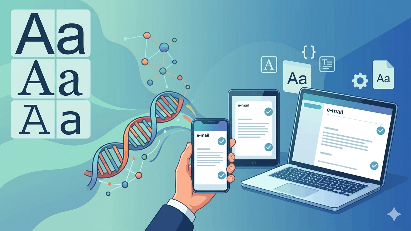

Typography plays a crucial role in email marketing, yet it remains one of the most challenging aspects of email design. Unlike web design, where designers have access to thousands of fonts through services like Google Fonts or Adobe Fonts, email design requires a more conservative approach. This comprehensive guide will help you navigate the world of email-safe fonts and ensure your messages look perfect across all email clients and devices.
Understanding Email-Safe Fonts
Email-safe fonts, also known as web-safe fonts, are typefaces that are pre-installed on most operating systems and devices. These fonts are considered "safe" because they'll display consistently across different email clients, from Gmail and Outlook to Apple Mail and mobile devices. When a font isn't available on a recipient's device, the email client will fall back to its default font, potentially disrupting your carefully crafted design. This makes choosing the right email-safe fonts crucial for maintaining brand consistency and readability. Once your typography is locked in, the next question is usually how to structure the HTML around it correctly.
The Ultimate List of Email-Safe Fonts
Here's a comprehensive list of the most reliable email-safe fonts, categorized by style:
Sans-Serif Fonts
- Arial - The most widely used sans-serif font in emails
- Helvetica - Popular in iOS devices and highly readable
- Verdana - Designed specifically for screen readability
- Tahoma - Excellent for body text in smaller sizes
- Trebuchet MS - Great for headlines and subheaders
- Geneva - A classic choice for professional communications
Serif Fonts
- Times New Roman - The standard serif font across platforms
- Georgia - Designed for screen readability with elegant proportions
- Times - Classic newspaper-style font
- Palatino - Elegant choice for formal communications
- Courier New - Monospaced font perfect for code snippets
Contemporary Safe Choices
- Segoe UI - Microsoft's interface font
- Calibri - Microsoft Office's default font since 2007
- Open Sans - While not pre-installed, widely supported
- Roboto - Google's system font, safe for Android users
Creating Bulletproof Font Stacks
A font stack is a prioritized list of fonts that tells email clients which fonts to use in order of preference. Here are some proven font stack combinations:
font-family: Arial, Helvetica, sans-serif;
font-family: "Trebuchet MS", Arial, sans-serif;
font-family: Georgia, Times, "Times New Roman", serif;
font-family: "Segoe UI", Helvetica, Arial, sans-serif;
Best Practices for Email Font Implementation
Font Size Considerations
The baseline for email body text should be 14-16px. Consider these guidelines:
- Headlines: 22-28px
- Subheaders: 18-20px
- Body text: 14-16px
- Footer text: 12px minimum
- Mobile optimization: minimum 16px for body text
Line Height and Spacing
Proper spacing enhances readability:
- Set line-height between 1.4 and 1.6 for body text
- Use appropriate paragraph spacing (16-20px)
- Maintain consistent heading spacing
- Allow breathing room around CTAs
Color and Contrast
Ensure optimal readability with these principles:
- Maintain a minimum contrast ratio of 4.5:1
- Use dark text on light backgrounds for body copy
- Avoid pure black text (#000) - opt for dark gray (#333)
- Test color combinations across different devices
Technical Implementation
HTML and CSS Best Practices
<div style="font-family: Arial, Helvetica, sans-serif; font-size: 16px; line-height: 1.5; color: #333333;"> <h1 style="font-family: Georgia, Times, 'Times New Roman', serif; font-size: 28px; color: #000000;"> Your Heading Here </h1> <p style="margin: 0 0 20px 0;"> Your paragraph text here </p> </div>Fallback Strategies
- Always include multiple font options in your stack
- Use web-safe fonts as fallbacks for custom fonts
- Test rendering across major email clients
- Implement proper fallback styling for unsupported features
Common Font Challenges and Solutions
Outlook-Specific Issues
- Outlook Windows often ignores certain font styles
- Use conditional CSS for Outlook-specific fixes
- Implement MSO conditional comments when necessary
- Test thoroughly in Outlook desktop versions
Mobile Considerations
- Ensure font sizes are readable on small screens
- Use responsive design principles for font scaling
- Test on various mobile email clients
- Consider touch-friendly spacing for interactive elements
Testing and Quality Assurance
Essential Testing Steps
- Test across major email clients
- Verify rendering on different devices
- Check font rendering in dark mode
- Validate accessibility standards
- Ensure proper fallback font display
Testing Tools
- Email on Acid
- Litmus
- Campaign Monitor
- Gmail Preview Mode
- Native email clients
Advanced Typography Techniques
Responsive Typography
@media screen and (max-width: 480px) {
.email-body { font-size: 16px !important; }
.email-heading { font-size: 24px !important; }
}
Custom Font Integration
While custom fonts can be used, always ensure proper fallbacks:
@font-face { font-family: 'CustomFont'; src: url('customfont.woff2') format('woff2'), url('customfont.woff') format('woff'); font-weight: normal; font-style: normal; }Design Considerations for Different Email Types
Marketing Emails
- Use bold, attention-grabbing headlines
- Maintain brand consistency
- Implement clear visual hierarchy
- Focus on CTA visibility
Transactional Emails
- Prioritize readability
- Use conservative font choices
- Maintain professional appearance
- Ensure critical information stands out
Newsletter Design
- Balance different content types
- Use consistent font hierarchy
- Implement scannable sections
- Consider long-form reading comfort
Future of Email Typography
The landscape of email typography continues to evolve with:
- Improved support for custom fonts
- Better dark mode adaptability
- Enhanced mobile optimization
- Greater accessibility standards
- Integration with design systems
Conclusion
Choosing and implementing the right fonts for email is crucial for effective communication and brand consistency. By following these guidelines and best practices, you can ensure your emails look professional and remain readable across all devices and email clients. Remember to always test thoroughly and maintain a balance between design aesthetics and practical functionality.
Looking to improve your email typography? Start by implementing these proven font stacks and best practices in your next email campaign.
Related Reading
- What Is an HTML Email Editor? — pick the right tool for building emails around these font stacks
- How to Create a Mail Using HTML: A Complete Guide — the full markup and CSS structure your fonts live inside
- The Complete Guide to Email Marketing — see how design fits into the bigger campaign picture
PagenflowMay 14, 2026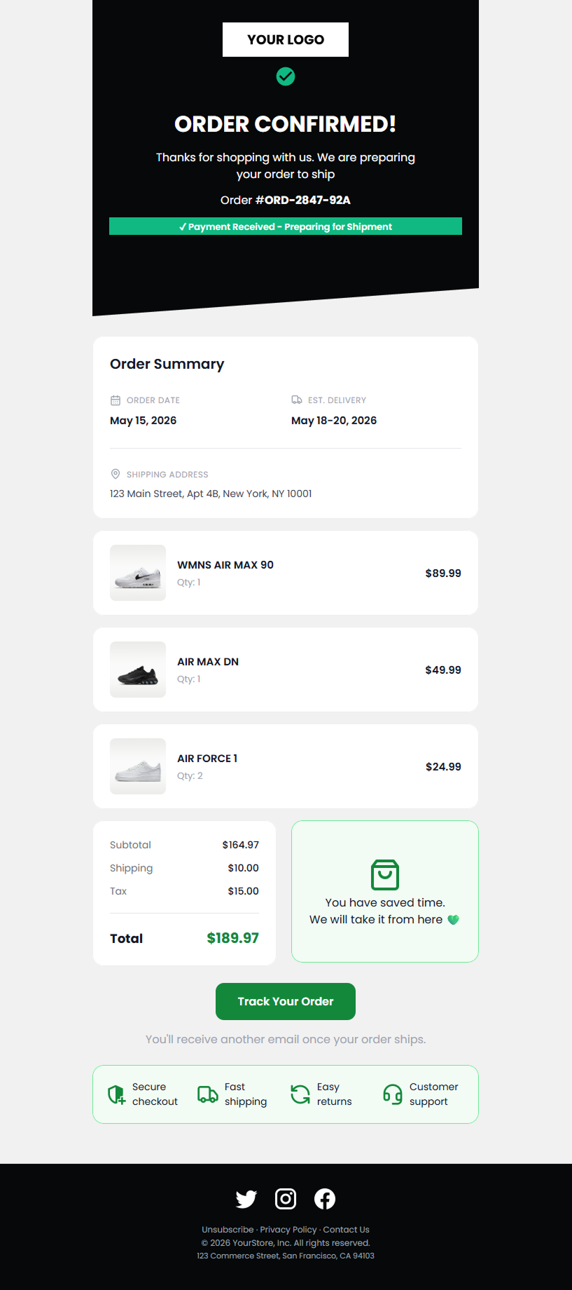 PagenflowMay 2, 2026Mastering Shopify Email Design: The 2026 Professional Customization GuideMove beyond basic layouts. Learn how to use custom Liquid, advanced CSS for dark mode, and React-email standards to create Shopify templates that truly represent your brand.PagenflowApril 19, 2026
 PagenflowJune 6, 2026
 PagenflowApril 19, 2026
Ready to build your next email template?
Drag, drop, done. Build pixel-perfect, responsive emails in minutes — no HTML wrestling required.
No credit card required
Tested across Gmail, Outlook, Apple Mail & more.